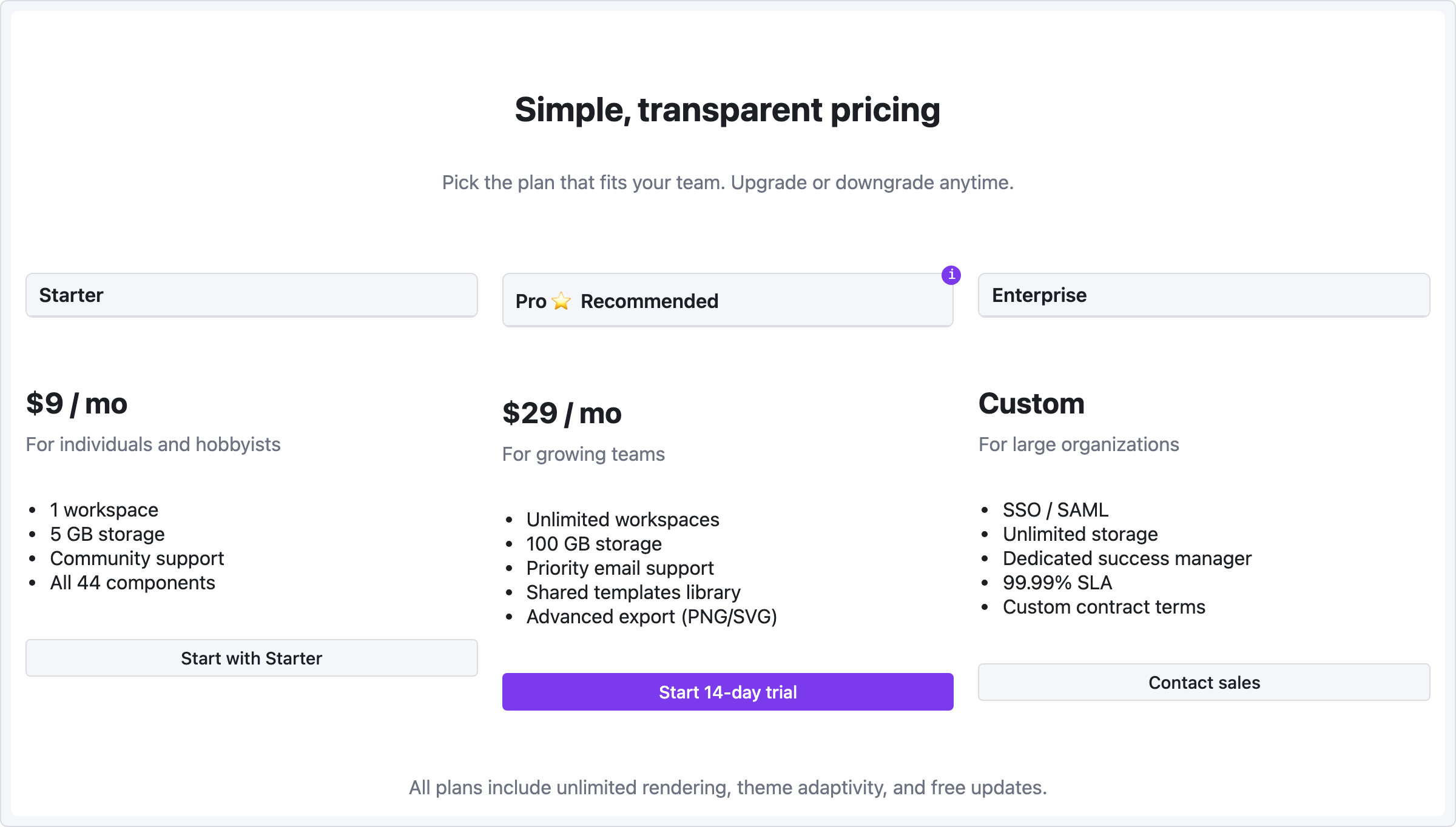
Recipe — Pricing Page
Three-tier pricing layout with a highlighted recommended plan, feature lists, and CTA buttons per tier.
viewport: desktop
screen:
  - spacer: { size: 40 }
  - heading:
      level: 1
      text: "Simple, transparent pricing"
      align: center
  - spacer: { size: 8 }
  - text:
      value: "Pick the plan that fits your team. Upgrade or downgrade anytime."
      tone: muted
      align: center
  - spacer: { size: 40 }
  - row:
      gap: 20
      items:
        - col:
            flex: 1
            items:
              - panel: { header: "Starter" }
              - container:
                  pad: 20
              - heading: { level: 2, text: "$9 / mo" }
              - text: { value: "For individuals and hobbyists", tone: muted }
              - spacer: { size: 16 }
              - list:
                  items:
                    - "1 workspace"
                    - "5 GB storage"
                    - "Community support"
                    - "All 44 components"
              - spacer: { size: 20 }
              - button: { label: "Start with Starter", variant: secondary, w: "100%" }
        - col:
            flex: 1
            items:
              - panel:
                  header: "Pro  ⭐ Recommended"
                  note: "Most popular — 80% of teams pick this"
              - container:
                  pad: 20
              - heading: { level: 2, text: "$29 / mo" }
              - text: { value: "For growing teams", tone: muted }
              - spacer: { size: 16 }
              - list:
                  items:
                    - "Unlimited workspaces"
                    - "100 GB storage"
                    - "Priority email support"
                    - "Shared templates library"
                    - "Advanced export (PNG/SVG)"
              - spacer: { size: 20 }
              - button: { label: "Start 14-day trial", variant: primary, w: "100%" }
        - col:
            flex: 1
            items:
              - panel: { header: "Enterprise" }
              - container:
                  pad: 20
              - heading: { level: 2, text: "Custom" }
              - text: { value: "For large organizations", tone: muted }
              - spacer: { size: 16 }
              - list:
                  items:
                    - "SSO / SAML"
                    - "Unlimited storage"
                    - "Dedicated success manager"
                    - "99.99% SLA"
                    - "Custom contract terms"
              - spacer: { size: 20 }
              - button: { label: "Contact sales", variant: secondary, w: "100%" }
  - spacer: { size: 28 }
  - text:
      value: "All plans include unlimited rendering, theme adaptivity, and free updates."
      tone: muted
      align: center
Pattern notes
- Each tier is a
col { flex: 1 }so widths split evenly regardless of viewport — scale with the frame. - The "Recommended" tier uses a
note:on the panel (ⓘ tooltip) plus a visual ⭐ in the header text — highlights the preferred plan without needing a distinct visual variant. - CTA buttons are
w: "100%"so they fill their column and lineup across tiers. - The bottom
textwithtone: mutedis a legal/reassurance footer — common in pricing pages.