Recipe — Admin Table
User management screen with search, filter tabs, a data table, and pagination. One of the most common admin UI patterns.
viewport: desktop
screen:
  - navbar:
      brand: "Admin Console"
      items: ["Users", "Billing", "Settings", "Logout"]
  - spacer: { size: 20 }
  - row:
      gap: 12
      align: center
      items:
        - heading: { level: 1, text: "Users" }
        - col: { flex: 1, items: [] }
        - search: { placeholder: "Search by name or email...", w: 280 }
        - button: { label: "Export CSV", variant: secondary }
        - button: { label: "+ Invite user", variant: primary }
  - spacer: { size: 16 }
  - row:
      gap: 12
      align: center
      items:
        - tabs:
            items: ["All (247)", "Active (220)", "Invited (15)", "Suspended (12)"]
            active: 0
        - col: { flex: 1, items: [] }
        - select:
            placeholder: "Filter: Role"
            options: ["All roles", "Admin", "Member", "Viewer"]
            w: 160
  - spacer: { size: 8 }
  - table:
      columns: ["Name", "Email", "Role", "Status", "Last active", "Actions"]
      rows:
        - ["Ada Lovelace",    "ada@example.com",    "Admin",   "Active",     "2 min ago",   "⋯"]
        - ["Ben Tanner",      "ben@example.com",    "Member",  "Active",     "1 hour ago",  "⋯"]
        - ["Clara Kim",       "clara@example.com",  "Member",  "Invited",    "—",           "⋯"]
        - ["Dan Rivera",      "dan@example.com",    "Viewer",  "Active",     "1 day ago",   "⋯"]
        - ["Eve Wei",         "eve@example.com",    "Admin",   "Suspended",  "14 days ago", "⋯"]
        - ["Frances Park",    "frances@example.com","Member",  "Active",     "3 hours ago", "⋯"]
        - ["George Kovacs",   "george@example.com", "Viewer",  "Active",     "5 min ago",   "⋯"]
  - spacer: { size: 12 }
  - row:
      gap: 12
      align: center
      items:
        - text: { value: "Showing 7 of 247 users", tone: muted }
        - col: { flex: 1, items: [] }
        - pagination: { current: 1, total: 36 }
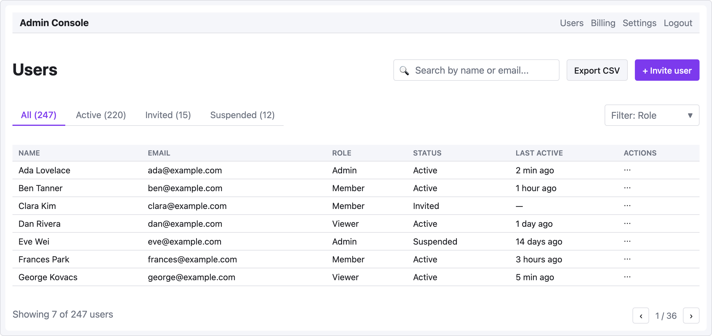
Pattern notes
- Action bar layout — heading on the left, actions on the right, with
col { flex: 1 }absorbing space between them. The three action elements (search, export, invite) stay grouped together on the right. - Filter tabs with counts — include counts in tab labels (
"All (247)") for at-a-glance status. Separate role filter on the right of the tabs row. - Actions column in the table is represented with
⋯— a mid-fi placeholder for the "open row menu" button. In a high-fi design you'd draw actual icons. - Pagination footer shows count + page navigation, with the same flex spacer idiom.