Recipe — Admin Dashboard
Classic three-area layout: top navbar, left sidebar, main content with cards and a table. Uses the grid layout for structural clarity.
viewport: desktop
screen:
  grid:
    areas:
      - "nav  nav  nav"
      - "side main main"
      - "side main main"
    cols: "220px 1fr 1fr"
    rows: "56px 1fr 1fr"
    map:
      nav:
        navbar:
          brand: "Ops Console"
          items: ["Dashboard", "Users", "Billing", "Settings"]
      side:
        sidebar:
          items: ["Overview", "Activity", "Reports", "API keys", "Team", "Support"]
          active: "Overview"
      main:
        chart:
          kind: bar
          label: "Active users (last 30 days)"
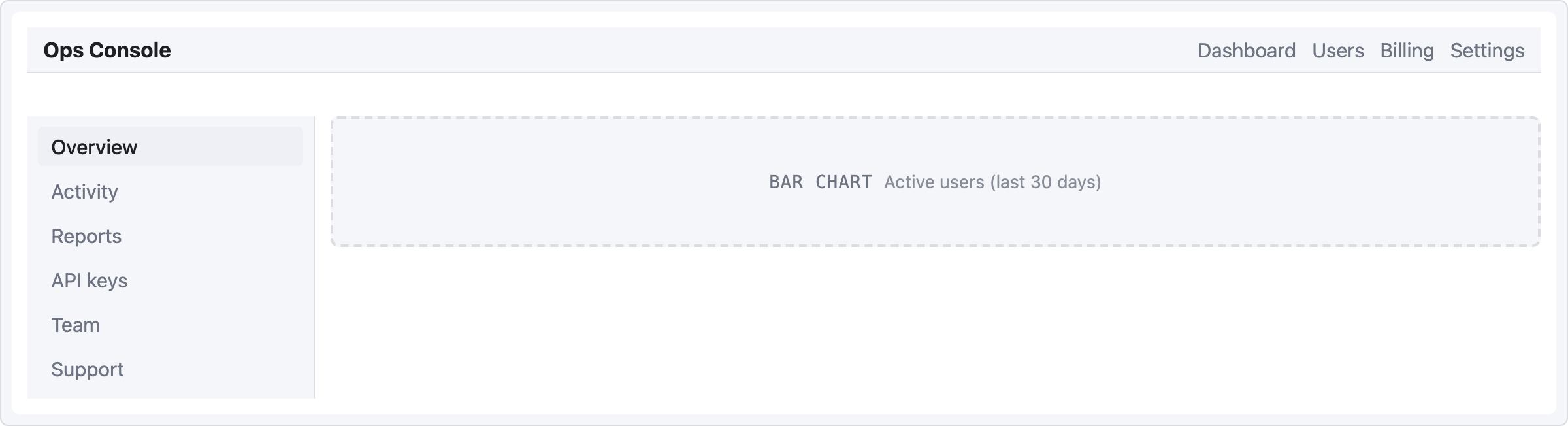
grid.map only accepts a single component per area, so the main cell holds one chart placeholder here. To layer multiple components inside the main area (cards + chart + table), use the flex model below — row/col aren't valid in grid.map.
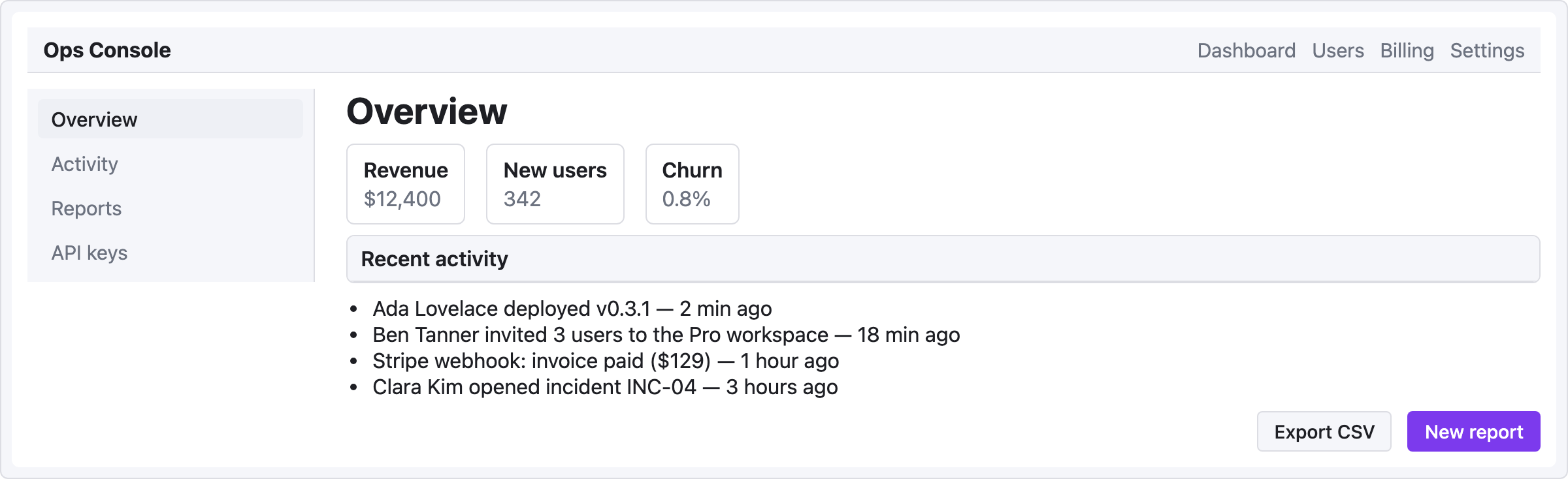
Flex variant (more layered content)
When you need real nesting inside the main area, the flex model scales better:
viewport: desktop
screen:
  - navbar:
      brand: "Ops Console"
      items: ["Dashboard", "Users", "Billing", "Settings"]
  - row:
      gap: 24
      items:
        - col:
            flex: 0
            items:
              - sidebar:
                  w: 220
                  items: ["Overview", "Activity", "Reports", "API keys"]
                  active: "Overview"
        - col:
            flex: 1
            items:
              - heading: { level: 1, text: "Overview" }
              - row:
                  gap: 16
                  items:
                    - card: { title: "Revenue",   body: "$12,400" }
                    - card: { title: "New users", body: "342" }
                    - card: { title: "Churn",     body: "0.8%" }
              - panel: { header: "Recent activity" }
              - list:
                  items:
                    - "Ada Lovelace deployed v0.3.1 — 2 min ago"
                    - "Ben Tanner invited 3 users to the Pro workspace — 18 min ago"
                    - "Stripe webhook: invoice paid ($129) — 1 hour ago"
                    - "Clara Kim opened incident INC-04 — 3 hours ago"
              - row:
                  gap: 12
                  items:
                    - col: { flex: 1, items: [] }
                    - button: { label: "Export CSV", variant: secondary }
                    - button: { label: "New report", variant: primary }
When to use which
- Grid — layout is fixed, areas are named, you care about exact columns/rows.
- Flex (row/col) — content grows organically, you want ratios like 1:3, easier to nest deeply.
Most dashboards I've seen look cleaner with flex + a top navbar, unless you have a truly grid-shaped data layout (e.g. a 4×3 metric grid).