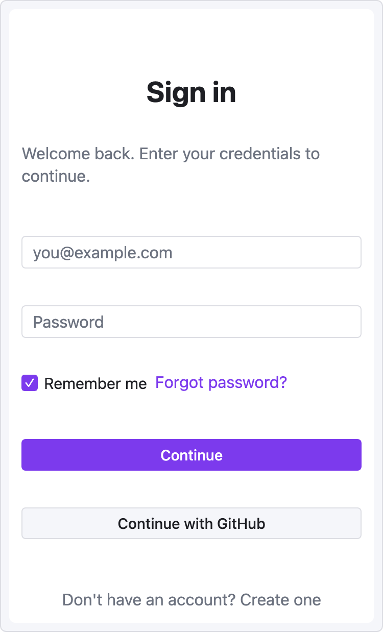
Recipe — Login Form
Centered mobile-width form. Demonstrates the mobile viewport, vertical stacking, and button variants.
viewport: mobile
screen:
  - spacer: { size: 40 }
  - heading:
      level: 1
      text: "Sign in"
      align: center
  - spacer: { size: 8 }
  - text:
      value: "Welcome back. Enter your credentials to continue."
      tone: muted
      align: center
  - spacer: { size: 24 }
  - input:
      placeholder: "you@example.com"
  - spacer: { size: 12 }
  - input:
      placeholder: "Password"
  - spacer: { size: 8 }
  - row:
      gap: 8
      items:
        - checkbox: { label: "Remember me", checked: true }
        - text: { value: "Forgot password?", tone: accent, align: end }
  - spacer: { size: 20 }
  - button:
      label: "Continue"
      variant: primary
      w: "100%"
  - spacer: { size: 12 }
  - button:
      label: "Continue with GitHub"
      variant: secondary
      w: "100%"
  - spacer: { size: 24 }
  - text:
      value: "Don't have an account? Create one"
      tone: muted
      align: center
Variations
Desktop signup with two columns — keep the form centered in a fixed-width column using base-prop widths:
viewport: desktop
screen:
  - row:
      items:
        - col:
            flex: 1
            items: []
        - col:
            flex: 0
            items:
              - heading: { text: "Create account", w: 360 }
              - input:    { placeholder: "Email",    w: 360 }
              - input:    { placeholder: "Password", w: 360 }
              - button:   { label: "Sign up", variant: primary, w: 360 }
        - col:
            flex: 1
            items: []

The two empty cols with flex: 1 act as left/right gutters, centering the form in a responsive way.
Common gotchas
w: "100%"works — string widths are passed straight through as CSS.- Mobile viewport is 375px wide. The form won't overflow unless you set explicit larger widths on children.
spacer:beats nested padding when you need precise vertical gaps.