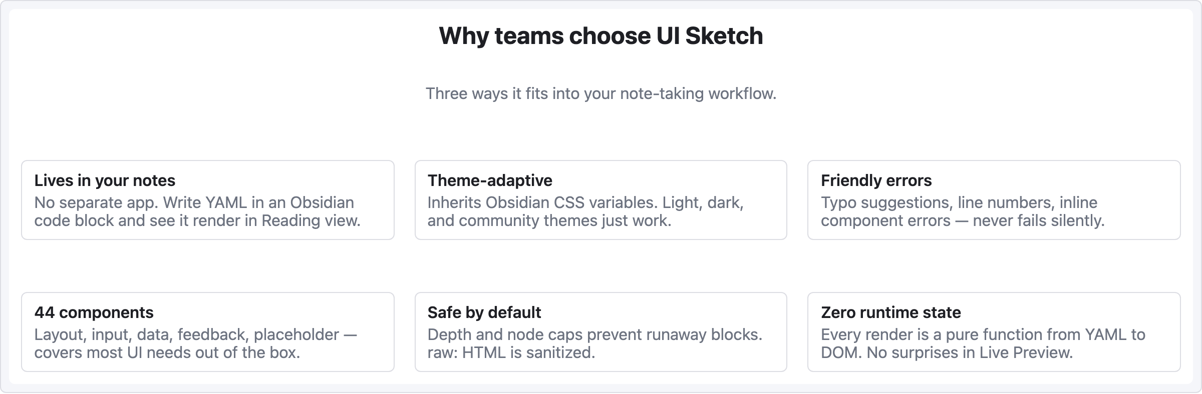
Recipe — Card Grid
Three-across feature or product cards. Works well for landing page feature sections, product catalogs, or team member lists.
viewport: desktop
screen:
  - heading:
      level: 2
      text: "Why teams choose UI Sketch"
      align: center
  - spacer: { size: 8 }
  - text:
      value: "Three ways it fits into your note-taking workflow."
      tone: muted
      align: center
  - spacer: { size: 32 }
  - row:
      gap: 20
      items:
        - col:
            flex: 1
            items:
              - card:
                  title: "Lives in your notes"
                  body: "No separate app. Write YAML in an Obsidian code block and see it render in Reading view."
        - col:
            flex: 1
            items:
              - card:
                  title: "Theme-adaptive"
                  body: "Inherits Obsidian CSS variables. Light, dark, and community themes just work."
        - col:
            flex: 1
            items:
              - card:
                  title: "Friendly errors"
                  body: "Typo suggestions, line numbers, inline component errors — never fails silently."
  - spacer: { size: 28 }
  - row:
      gap: 20
      items:
        - col:
            flex: 1
            items:
              - card:
                  title: "44 components"
                  body: "Layout, input, data, feedback, placeholder — covers most UI needs out of the box."
        - col:
            flex: 1
            items:
              - card:
                  title: "Safe by default"
                  body: "Depth and node caps prevent runaway blocks. raw: HTML is sanitized."
        - col:
            flex: 1
            items:
              - card:
                  title: "Zero runtime state"
                  body: "Every render is a pure function from YAML to DOM. No surprises in Live Preview."
Pattern notes
- Each
col { flex: 1 }makes the three cards equal width — flex-grow ratios split the row evenly. - The second row of cards is a separate
rowentry; wrapping into multiple rows is manual (no auto-wrap grid). - Longer card bodies push all cards in that row to match heights in browsers — if you want strict height, use
h:on each card.