Recipe — Analytics Dashboard
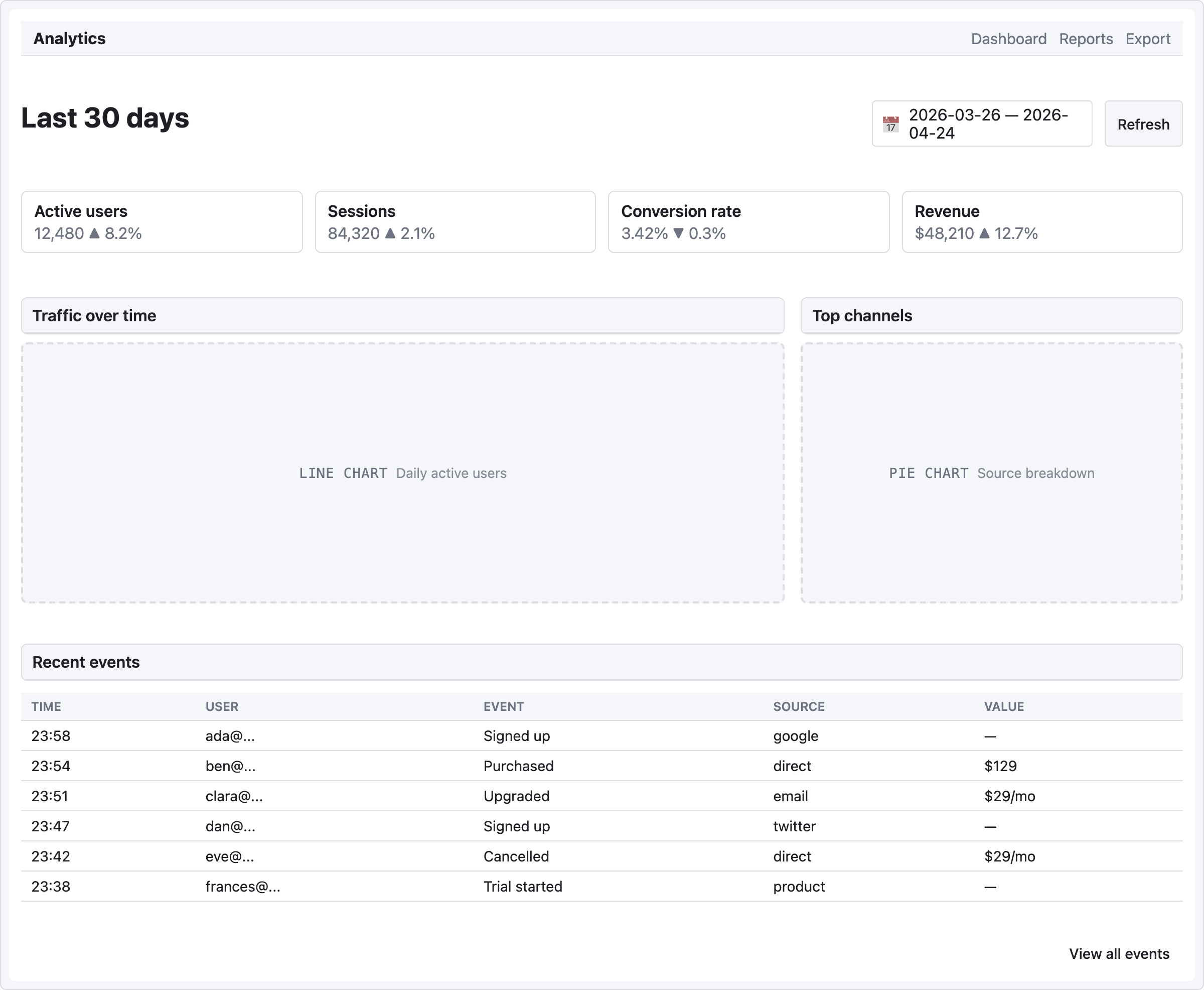
KPI cards at the top, chart placeholders below, recent events table at the bottom. The "everything at a glance" view.
viewport: desktop
screen:
  - navbar:
      brand: "Analytics"
      items: ["Dashboard", "Reports", "Export"]
  - spacer: { size: 20 }
  - row:
      gap: 12
      align: center
      items:
        - heading: { level: 1, text: "Last 30 days" }
        - col: { flex: 1, items: [] }
        - date-picker: { value: "2026-03-26 — 2026-04-24", w: 220 }
        - button: { label: "Refresh", variant: secondary }
  - spacer: { size: 20 }
  - row:
      gap: 12
      items:
        - col:
            flex: 1
            items:
              - card:
                  title: "Active users"
                  body: "12,480   ▲ 8.2%"
        - col:
            flex: 1
            items:
              - card:
                  title: "Sessions"
                  body: "84,320   ▲ 2.1%"
        - col:
            flex: 1
            items:
              - card:
                  title: "Conversion rate"
                  body: "3.42%   ▼ 0.3%"
        - col:
            flex: 1
            items:
              - card:
                  title: "Revenue"
                  body: "$48,210   ▲ 12.7%"
  - spacer: { size: 20 }
  - row:
      gap: 16
      items:
        - col:
            flex: 2
            items:
              - panel: { header: "Traffic over time" }
              - chart: { kind: line, label: "Daily active users", h: 260 }
        - col:
            flex: 1
            items:
              - panel: { header: "Top channels" }
              - chart: { kind: pie, label: "Source breakdown", h: 260 }
  - spacer: { size: 16 }
  - panel: { header: "Recent events" }
  - table:
      columns: ["Time", "User", "Event", "Source", "Value"]
      rows:
        - ["23:58", "ada@...",    "Signed up",     "google",   "—"]
        - ["23:54", "ben@...",    "Purchased",     "direct",   "$129"]
        - ["23:51", "clara@...",  "Upgraded",      "email",    "$29/mo"]
        - ["23:47", "dan@...",    "Signed up",     "twitter",  "—"]
        - ["23:42", "eve@...",    "Cancelled",     "direct",   "$29/mo"]
        - ["23:38", "frances@...", "Trial started", "product",  "—"]
  - spacer: { size: 12 }
  - row:
      items:
        - col: { flex: 1, items: [] }
        - button: { label: "View all events", variant: ghost }
Pattern notes
- KPI cards use 4 ×
col { flex: 1 }— the classic "at a glance" row of metrics. Mix the value with a delta indicator in the body text (▲ 8.2%/▼ 0.3%). - Charts at 2:1 ratio — the line chart (primary) gets 2 shares of width, the pie chart (secondary) gets 1. Both inside their own
panelso they're visually grouped. - Chart placeholders accept a
kind:hint (bar/line/pie) that shapes the silhouette. Good enough for mid-fi; upgrade to a real chart library in implementation. date-pickerin the action bar at top holds the current filter range as literal text — mid-fi pattern, no actual picker behavior.